TAIPEI FUBON BRAVES | ID ANIMATION & MASCOT REDESIGN
臺北富邦勇士籃球隊 為2021–22年賽季年度總冠軍,Knock-Knock Animation的首要工作是為球隊的吉祥物 - BILL,設計升級版的2022新形象,同步為新賽季設計專屬的主題動畫,讓信念與力量直接推進連霸之路。
The TAIPEI FUBON BRAVES basketball team is the champion of the year for the 2021-22 season.
Knock-Knock Animation's first task is to design a new, upgraded version of the team's mascot, BILL, for the 2022 season, along with an exclusive theme animation for the new season, to give the team the belief and power to push straight to the championship.
MASCOT REDESIGN

吉祥物 - BILL,初版比例是美式寫實為主,考量到未來延伸的動畫,媒體應用 與 產品延伸,將比例設計成Nendoroid方向的設定,但為了還是保有他的帥度,比例上的調整其實是很細微的,最終才設計定案在以上版本。
The initial scale of the mascot, BILL, is mainly American realistic. In consideration of the future extension of animation,
media applications and product extensions, the scale was designed in the direction of Nendoroid, but in order to retain his handsomeness, the proportion was actually adjusted very slightly before the final design was finalised in the above version.

將初版的衣服圖案放置角色上,會略顯複雜,且讓身體的一些肌肉線條美被抵銷模糊。
Placing the first version of the dress pattern on the character is slightly complicated
and dilutes the beauty of some of the muscular lines of the body.


BILL 定案版 - 將線條保留在最簡潔的狀態,保留頭部籃球線條與胸部B之logo,
強化肩膀線條,與增加手套與靴子上之局部發亮光線,讓力量/帥氣/現代感 取得三為一體的平衡。
BILL final version - Keeping the lines minimal, retaining the head basketball line and the B logo on the chest. The shoulder line has been strengthened and the gloves and boots have been given a partial shine, giving a balance of power, coolness and modernity.

對戰的第一版對手 - 骷髏人。經綜合評估後,第一個部份擔心有族群上的喜好問題,
第二點骷髏視覺形象太突出,可能會在短秒數的動畫中太吸引人的灌注,因此需再設計另外一款能保有設計又低調感的對手。
The first version of the opponent - the Skeletons. After a comprehensive evaluation, the first part of the design was concerned with ethnic preferences. Secondly, the visual image of the skeleton was too prominent and might attract too much attention
in the short seconds of animation.

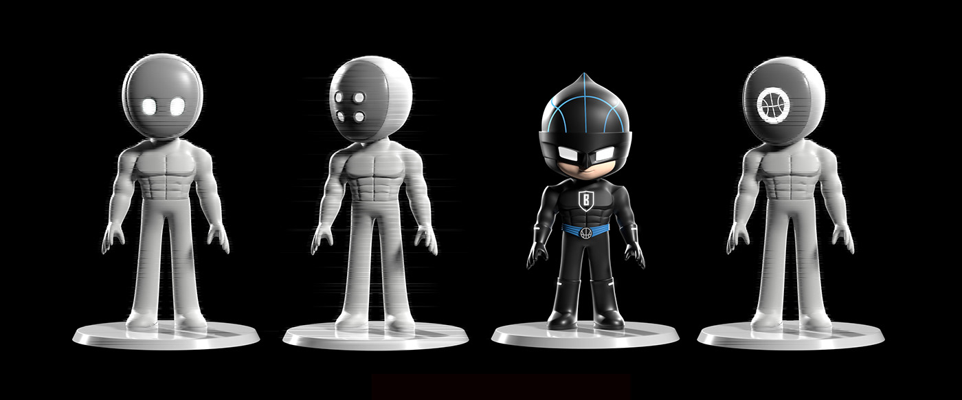
取自BILL的面具當重點視覺,設計了面具人當對戰的對手
The mask from BILL is used as the focal point of the visuals, and the masked man is designed as the opponent.

面具人 - 定案版。面具保有籃球圖案,身體走簡潔流線調性,這樣更像BILL世界的角色。
The Masked Man - Final version. The mask retains the basketball motif and the body has a simple, streamlined tone, which makes it more like a character from the BILL world.
POSE DESIGN

設計能應用容易使用在每種媒體與平面需求之POSE設定。
Designed to apply easy to use POSE settings for every media and graphic requirement.
SCENE DESIGN


場景設計有兩個重點 - 簡潔與數位。
因為BILL全身幾乎都是黑色為主色,亮色背景會讓我們覺得很沒有氣氛感,暗色背景又很容易埋沒在暗部中,在場景中我們以光的線條為主設計勾勒出數位感,讓暗部上也設計了次等graphic線條做細節上的輔助,最後再加上賽場上環狀地投影的時間廣告與環場的動態廣告,整個設計就趨近完成,最後搭配費心的光線設計,氛圍感終於達成最理想的樣子。
There are two key points in the scene design - simplicity and digital.
As BILL is almost entirely black, we felt that a bright background would be very uninspiring, while a dark background would be easily buried in the darkness. Finally, with the addition of a circularly projected time advertisement and a dynamic advertisement around the course, the whole design is almost complete, and finally with the painstaking light design, the atmosphere is finally ideal.
STYLEFRAME


MOTION


CREDIT
Client:TAIPEI FUBON BRAVES
Production DEPT.:Knock-Knock Animation 諾恩動畫
Director:莊絢淳
Design & Animation: Knock-Knock Animation 諾恩動畫
3D Character Redesign : 莊絢淳
Character Modeling : 莊絢淳
Character Texture : 莊絢淳
Character Rigging : 陳捷夫
Character Pose Design : 莊絢淳
Director:莊絢淳
Design & Animation: Knock-Knock Animation 諾恩動畫
3D Character Redesign : 莊絢淳
Character Modeling : 莊絢淳
Character Texture : 莊絢淳
Character Rigging : 陳捷夫
Character Pose Design : 莊絢淳
/
Story Of Animation ID:莊絢淳
Storyboard Of Animation ID:莊絢淳
Scene Design & Modeling : 莊絢淳
Scene Texture : 莊絢淳 / 陳捷夫
Layout : 莊絢淳
Animation : 莊絢淳
Lighting : 莊絢淳
VFX : 陸繼輝
Render : 莊絢淳
Compositing : 莊絢淳
Storyboard Of Animation ID:莊絢淳
Scene Design & Modeling : 莊絢淳
Scene Texture : 莊絢淳 / 陳捷夫
Layout : 莊絢淳
Animation : 莊絢淳
Lighting : 莊絢淳
VFX : 陸繼輝
Render : 莊絢淳
Compositing : 莊絢淳
/
聲音與配樂統籌 Sound and Music Supervisor :
燒聲娛樂實驗室 SoundME Studio
原創配樂 Original Music Composer : 陳立唐 Li-Tang Lewis Chen
聲音設計/ 混音 : Sound Designer / Re-recording Mixer : 張易婷 Mei Yi-Ting Chang
燒聲娛樂實驗室 SoundME Studio
原創配樂 Original Music Composer : 陳立唐 Li-Tang Lewis Chen
聲音設計/ 混音 : Sound Designer / Re-recording Mixer : 張易婷 Mei Yi-Ting Chang
/
Special Thanks : Queenie


